
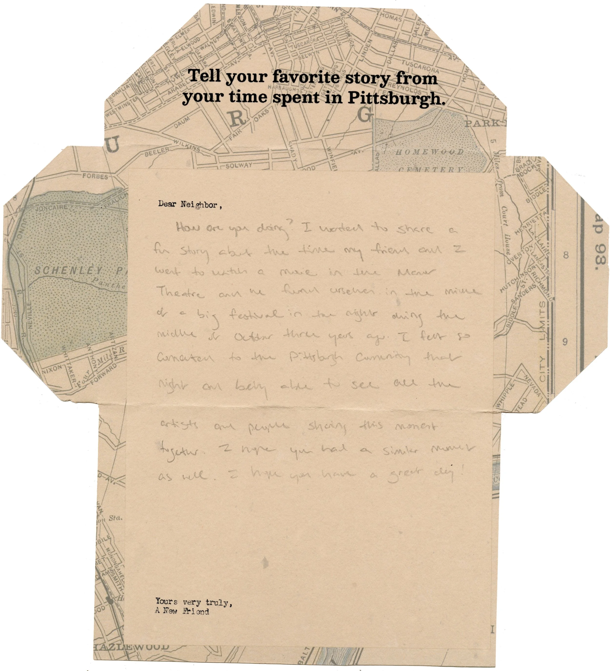
Dear Neighbor,
Collaborators
Dorothy Li
Programs
Adobe Illustrator, Adobe Photoshop, Adobe After Effects, Figma
A set of guiding prompts and empty letters for asynchronous exchange with anonymous neighbors at the corner of Murray and Darlington, located in the Squirrel Hill neighborhood of Pittsburgh, PA.
Date & Duration
Fall 2022, 7 weeks


Create an interaction which uses play to promote senses of place, unity, and belonging amongst two or more participants.
My partner, Dorothy, and I kicked off this project by considering the meaning of four words: Play, Place, Unity, and Belonging. We worked together to dream up a mind map of each word and our associated thoughts. While we were at it, we also considered possible sites to visit and what sort of possible mediums we might want to think about for the final outcome of the project.
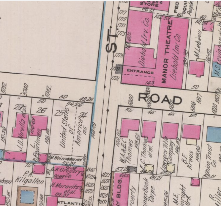
We scouted potential locations, and both individually come to the conclusion that we thought the corner outside the Manor (Murray and Darlington) was our best bet as a location. We worked to collect different kinds of information on the location. We surveyed in person, taking photos, and asking questions of those inhabiting the area. I did a deep dive into the history of the intersection and collected a wide range of old maps and street photography depicting the area.

We determined that this intersection is a community gathering place for a wide range of people from many different backgrounds. We knew our project should support and service that sense of community.
We decided on the concept of Dear Neighbor, a way for these community members to connect with one another through the space.
We began to develop a visual direction. I spent the majority of my time figuring out potential color schemes and typefaces: I began to take inspiration from many of the historical graphics I’d collected in my previous research. We used the bright beautiful colors we found within the maps within our final product.
I brought in my personal collection of antique graphics, and we all went through them together to discern which was best to take inspiration from. We looked to find fonts that spoke a similar language to those used in the antiques.
We printed out our final design, and gave our product to some test subjects in the area to respond to.